Spreadsheets as a Rough Annotation Tool
I needed to design some heuristic thresholds for grouping together items. In my first step attempt I iteratively tried to guess the thresholds by trying them on different examples. This was directionally useful but as I refined the thresholds I had to keep going back to check whether I had broken earlier examples. To improve this I used a spreadsheet as a rough annotation tool.
There are various tools for data entry like org mode tables in Emacs, or you can use a spreadsheet interface in R with data.entry (or via edit) or in Jupyter Notebooks. But I always find them kludgy when compared to full spreadsheet programs like Excel, Google Sheets, Libreoffice Calc or Gnumeric. For specific applications you could build a custom webform in HTML and CSS (or use a specific tool like for text annotation brat or prodi.gy), but a spreadsheet will do for simple things.
The approach is to get all the data you need to make the decision fit on a single screen; if you can’t do this a spreadsheet might not be the right tool. It’s generally quickest if you pick a simple binary annotation scheme (like y/n or 1/0); this means you can focus on making a single simple decision. If you don’t know just leave it blank and move on, the idea is to get the best return on investment. Generally this is challenging enough and if you need more detailed annotation you can do multiple rounds.
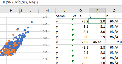
In my case I wanted to draw the points on a scatterplot based on the annotation to work out how to draw the decision boundary. I used a technique from a stackoverflow answer building it into separate columns with formulas like =IF($D2="y",$C2,NA()) to create a separate series for each label. This gave me a plot that showed the cases and I could get an idea of what a good decision boundary looks like and either eyeball one, or train a classifier on my newly labelled data.